Hi Friends,
I received a mail today from a DBA who was facing some issues with SQL Server Performance Monitor tool on Windows Server. And he was frustrated.
Why?
When he starts PerfMon, he gets the default window with %Processor Time counter already added, as shown below:

And he can select the counter to see the metrics on the panel above, values for Last, Average, Min, Max, etc.
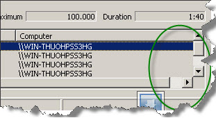
Now he adds some more counters and gets a horizontal and vertical scroll bar, as shown below:

Things become very irritating for him to scroll up & down just to select & monitor values for a small set of counters. He would like to see these small set of counters in a single pane.
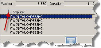
Well, you can get rid of both the scroll bars. Just double click on any separator and reduce the length of the column (or click on the separator and drag towards left until the scroll bar vanishes)

No scroll bars now and you can see all the counters in a single pane.

Sir,
Small change with great impact …
The graphs are not the best view. Change your view to report and you get a better, streamlined view with actual counters to monitor. Ditch the graphs! 🙂
To avoid another frustration:
If you want to open perfmon with some default counters from your own, just start it with the option sys (Perfmon /sys), populate the counters that you want, and the next time you open it with the sys option, your prefered counters will be there.
Thanks Tim for the inputs !
Ludo, infact, thats my next blog post 🙂